Re: GitHub no longer uses toasts
This article about why GitHub no longer uses toasts has been making rounds on the internet. In this article, we dive into what their arguments are, and whether their alternatives make sense.
For years I've been defaulting to the same pattern for toasts.
It's a very common pattern: when a user clicks a save button, a toast appears on the bottom right side of the UI. The toast will then automatically disappear after a few seconds.
This pattern got its popularity on mobile to make it clear that something was actually happening on slower connections.
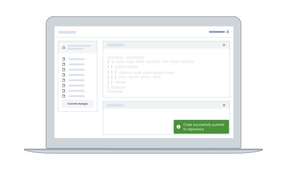
In the common pattern, the toast would trigger an error, the toast would not automatically disappear, and the error message would remain in sight, like so:

Now this “in sight” is one of the things that Github discusses. Near the end of the article, in the section "Usability Considerations", they note that many developers work on larger displays, and toasts placed on the bottom right might even go unnoticed as they sit outside of a user's immediate field of view.
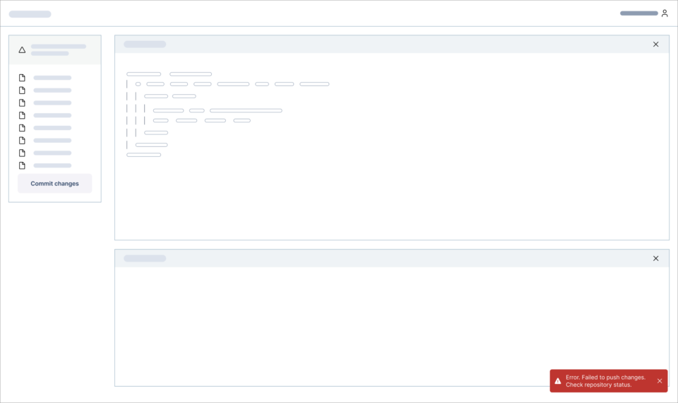
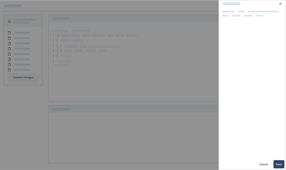
I've noticed this problem many times in my work but never had a real solution to it. I had a similar problem with drawers on the right side of screens: if you have a large monitor, it's pretty awful to do your work exclusively on the right hand side, like this:
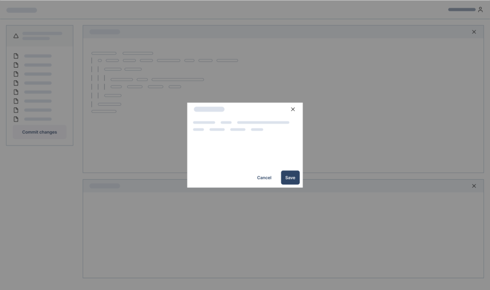
For many years, it's been my advice to simply use centered dialogs, which works for any screen size, both for a laptop...
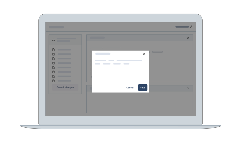
...and a larger desktop:
Github's advice
So what should you do to give a user feedback, instead of toasts according to Github?
They argue that for simple actions, it is actually not necessary to reinforce the action with a toast.
For complex actions, they argue that a banner is enough. Github calls the error element in the illustration below a banner; many design systems call it alert. The difference here being that the alert is not floating on the bottom right like a toast, but shown on top of the page after an action was performed.
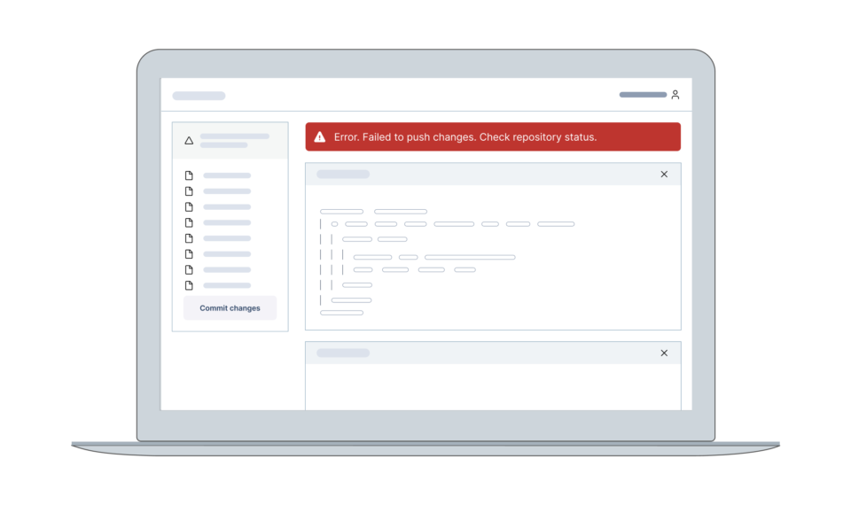
In the panel layout here, the advice immediately fails: it pushes down the bottom panel in the main area, making it harder to use.
In their notifications page they list many situations where the alert makes sense.
The main is the top of body situation, which works for a lot of situations.
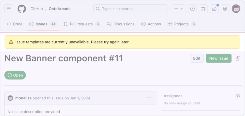
Example of a top of body banner ©Github
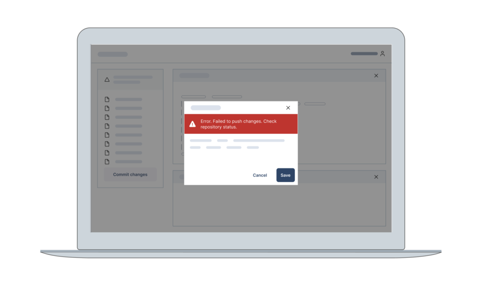
I like their example of showing the banners inside of the dialog content if the problem relates to the dialog:
My take
In my opinion, Github is a bit too quick to dismiss toasts: they don't give any examples for feedback on mobile, nor give any examples on what to do in a fixed panel layout (for example in a code editor: something Github makes as a platform!)
They are generally right in my opinion when it comes to pages that scroll (e.g. wizard type forms, settings pages): toasts should be avoided.
But not every type of screen is a scrolling web page on desktop. I wouldn't be be too quick to never use toasts anymore because Github said so.
The patterns they document only cover a subset of user interfaces.
I find that in general, many design patterns pages trip over their own examples by focusing on too few cases. This is a good example.
Github now makes a big deal about how “they don't use toasts any longer”. x
They really do mean it: I investigated Github Desktop (a basic GUI for git), and the iOS client, and I found zero toasts. It seems Github is really serious about this decision.
But in my eyes, they might have to revert their published opinion soon to an “it depends” if they would cover more use cases.
A main point they drive home is that toasts are inaccessible. What I would tend to do on the development side is use aria-live to speak out the changes when a toast appears. To my knowledge, that was a documented and test pattern that would work with voiceover. I haven't done the battery of tests that Github has supposedly done; Adam Silver on LinkedIn claims that
Github did thorough, moderated, task-based testing with blind, low vision, and motor control disabilities. A wide range of assistive technology was used, including NVDA, JAWS, VoiceOver, Windows Magnifier, Dragon, etc.
Now, you have to know, Adam Silver is a UX person who always takes a hardline stance about UI. His claim to fame is basically taking a barely nuanced stance and promoting those ideas on social media... it's basically what he does to get online attention. A reason he does that is... to sell his courses on design.
I would normally ignore this, But I'll bite in this case, because Github references this article in theirs. In his article about toasts, he also doesn't provide any real alternatives.
Here's my response to his take:
- Problem #1: They disappear automatically - That's the point for a success message - you see “Changes saved” and it disapears so you can move on. Having that read out quickly by a screen reader, then the screen reader continuing whatever else it was reading, seems fine to me, but again, I didn't do the accessibility tests that Github did (none of which are actually documented in their work, btw)
- Problem #2: They’re hard to use via keyboard - Legit concern and something I don't have an immediate solution for. I tend to not place actions in toasts and only use them for messaging.
- Problem #3: They can change state erratically: he gives an example about an action inside a toast that has a changing nature, something I would never use a toast for (see #2), to dismiss toasts in general.
- Problem #4: They’re distracting and can obscure the screen - Legit concern, but something's got to give if you want to give a user feedback - either a fixed positioned element or an in-page alert, there's not much more choices than that. See other parts of this blog post for my concerns about only relying on in-page alerts.
- Problem #5: They’re hard to spot: I pointed this out in this blog post as well, and I agree for larger screens, this can be a real problem. However, I mostly use these in a B2B app context, and there is a learning aspect to apps - people can get used to how an app works.
- Problem #6: They’re inconsistently located compared to other messages: This feels like some filler to complete the listicle. They have another location, because they function differently. Duh.
- Problem #7: It may not be clear what the message relates to: Again, not worth responding to, with another random gmail example that doesn't make much sense.
I am not 100% convinced yet if Github is right here.
The toast is a legitimate UI element that has a place in UI design.
I think their guidance is a good warning to not use toasts everywhere and default to in-page validation where possible. But I don't think this is your signal to never use toasts again.

As the founder of Obra Studio, Johan's mission is to help software companies get to the next design level. He’s forever looking for the perfect balance between aesthetics and usability.